webcraft
I design and develop the best personal websites money can buy.
The kind of website that gets shared and talked about just for how cool it looks. If this is the sort of thing you’re interested in creating, you can hire me. Let me know on Twitter or email (judah@joodaloop.com).
I’m also open to other kinds of design work, especially stuff that involves lots of text, including mini-sites and other web projects with special requirements (web books, community sites, etc). You’re welcome to reach out and see what else we can work on together–custom, human-scale sites are what I’m good at.
To those creative people who say “I don’t need a website,” I ask: why not have a personal website that works strategically, in parallel to your other activities? How could a website complement what you already do rather than competing or repeating? How can you make it fun or thought-provoking or (insert desired feeling here) for you? How can the process of making and cultivating a website contribute to your approach?
...each artist should create their own space on the web, for a website is an individual act of collective ambition.
Chances are, you’re coming to this page having seen my work before, and with a particular project in mind. In which case, you could skip straight to the Process section to read about what working with me is like.
you should probably not hire me if...
Your project requires a bunch of custom animations, sleek gradients or complicated transitions.
If you want a landing page that works like every other landing page out there. Please just buy one of the hundreds of templates, lots of them are free too.
If you want a site that scrolljacks it's readers.
If you're trying to make something "really fancy", instead of an atypical, purposeful, content-first site.
If you have no idea what you want apart from "a website", and aren't willing to spend time thinking about it. A personal website is your website, I can't conjure one out of thin air. I will help you figure things out, but please come in with concrete desires and preferences.
the product
The best compliment for any piece of creation is often a single earnest “wow”.
You want a really cool website. I’m assuming that’s your primary goal. You want it to be nice to look at, great to read, make visitors whistle in appreciation, etc. etc. You want a site that is custom-built to match match the vibe of your project/personality/community.
I work with people to get a sense of their aesthetic and preferences, and then design sites that they wouldn’t be able to dream up on their own. I’ve worked with descriptions like “Whole Earth Catalogue”, “LaTeX paper” and “teenage engineering”, and produced some of my best sites.
The most fun part of this process is when people start to see what’s really possible outside of the current meta of standard blog themes. How you can have sidenotes and bookshelves and media hoards and cool new navigation patterns. What it feels like to design something in your image.
If you want to get a bunch of words onto the internet as cheaply as possible, there’s never been more ways to go about it. Most blogging platforms will cost you less than $5/month–Tumblr and Twitter are free. If that’s all you want, my services are probably not what you’re looking for. However, if…
You want a personal website that is not just a blog.
Sure, it might include a chronological list of posts, but it ought to be more. It ought to have personality.
This is your website, you can choose what parts of you to show off, and how to display them. You might just want to make a list of things you love, and have that be your home on the web. You might want to build a timeline of your life. You might want a music collection in the form of a magazine. You can have a page with , that switches its theme according to the current temperature in your city. Heck, it can even have if you want them.
You don’t want to fit yourself into a pre-existing theme.
They’re often pretty lame. Let the WritersTM have their Substacks, let other startups have yet another version of the same landing page. You don’t have to be tied to bland UIs if you’d rather have something better.
You can play around with format, presentation, and arrangement. Your home page can be a list of select sentences from each post on your site. If long blog posts aren’t your thing, you can have your site be a Stream. Things get way more interesting once you can control the smallest of details.
You want to do something fun on the web.
A website could be a commonplace notebook. It could look like an entire app. It might have cool algorithm-generated art on the home page. It might even be a playable game. Even a minimal blog can feel extremely personal.
Everything I’ve made until today has only been scratching the surface, there’s so much more that’s possible.
the portfolio
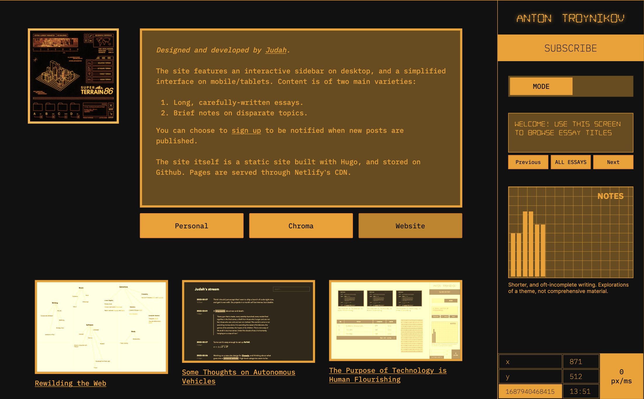
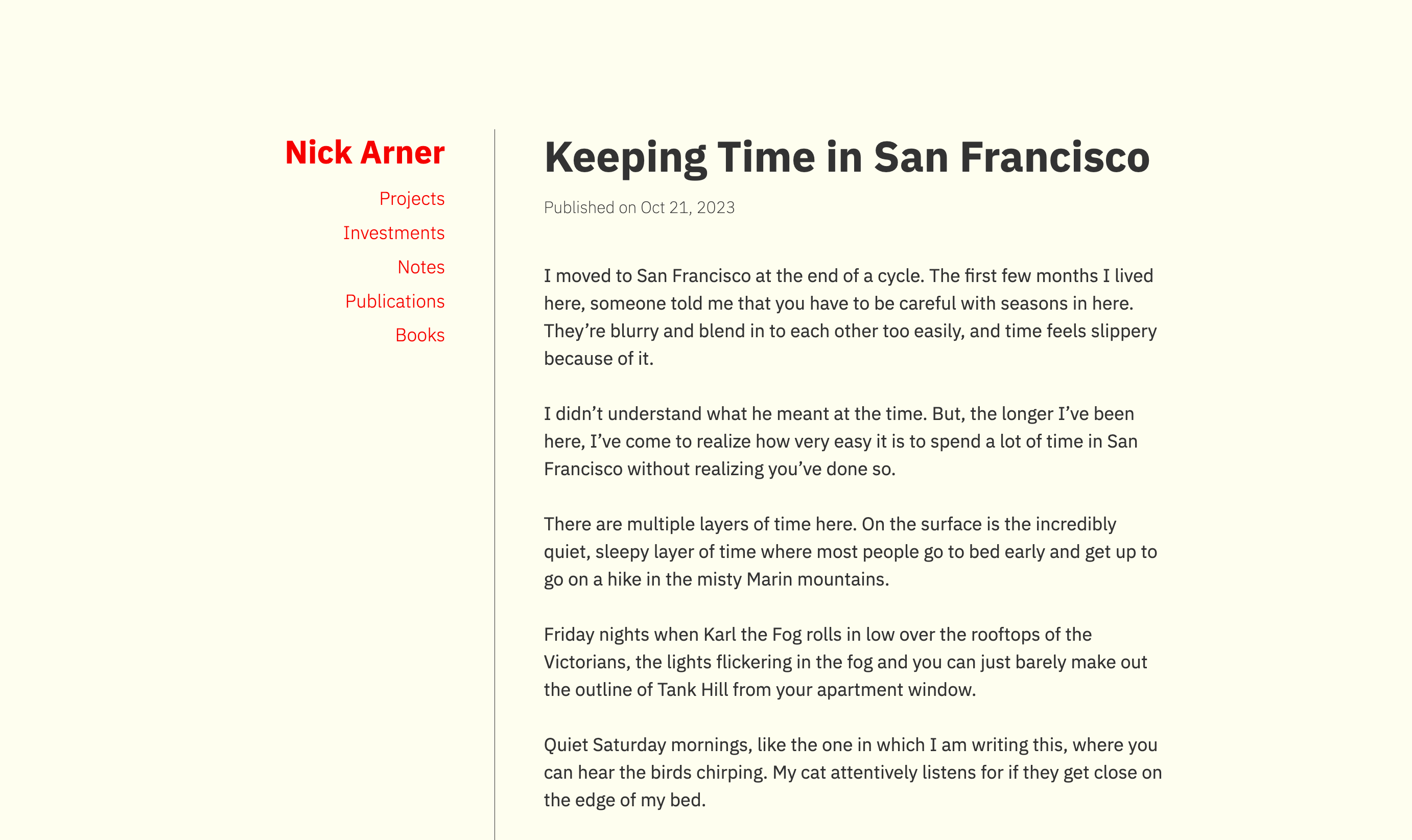
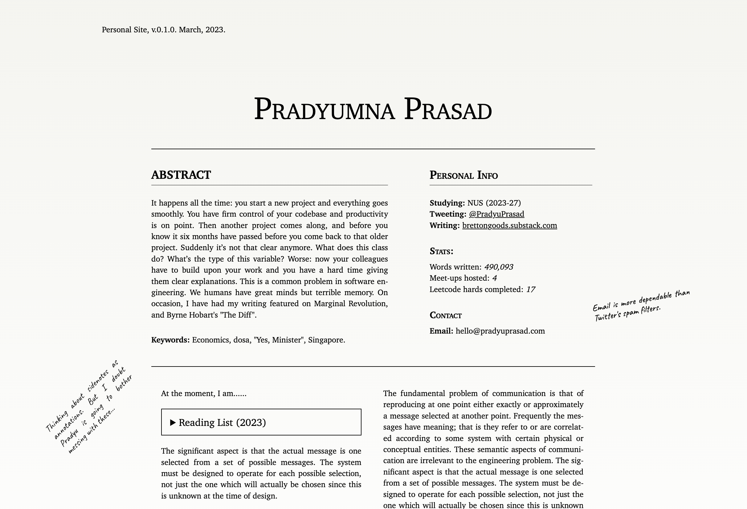
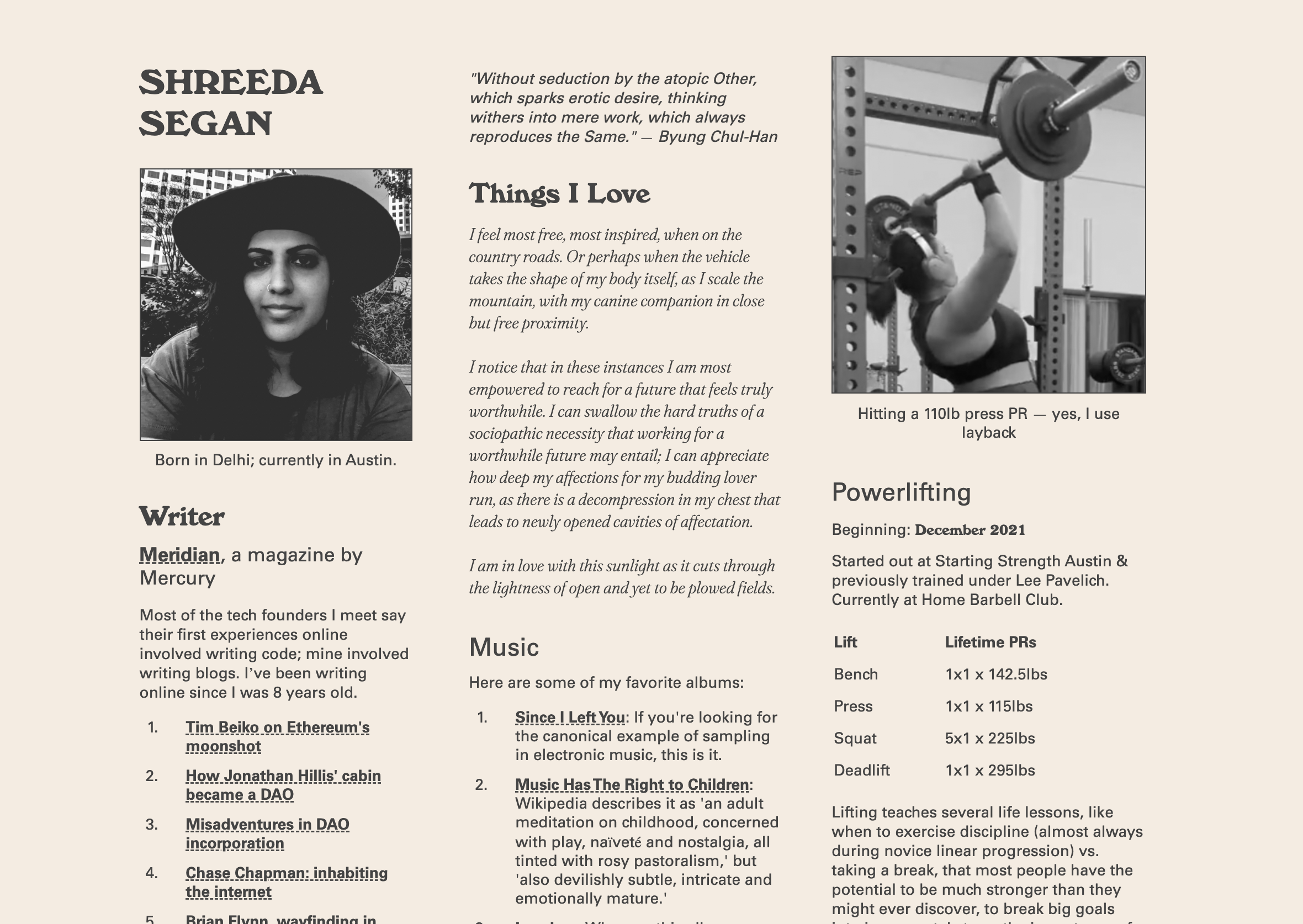
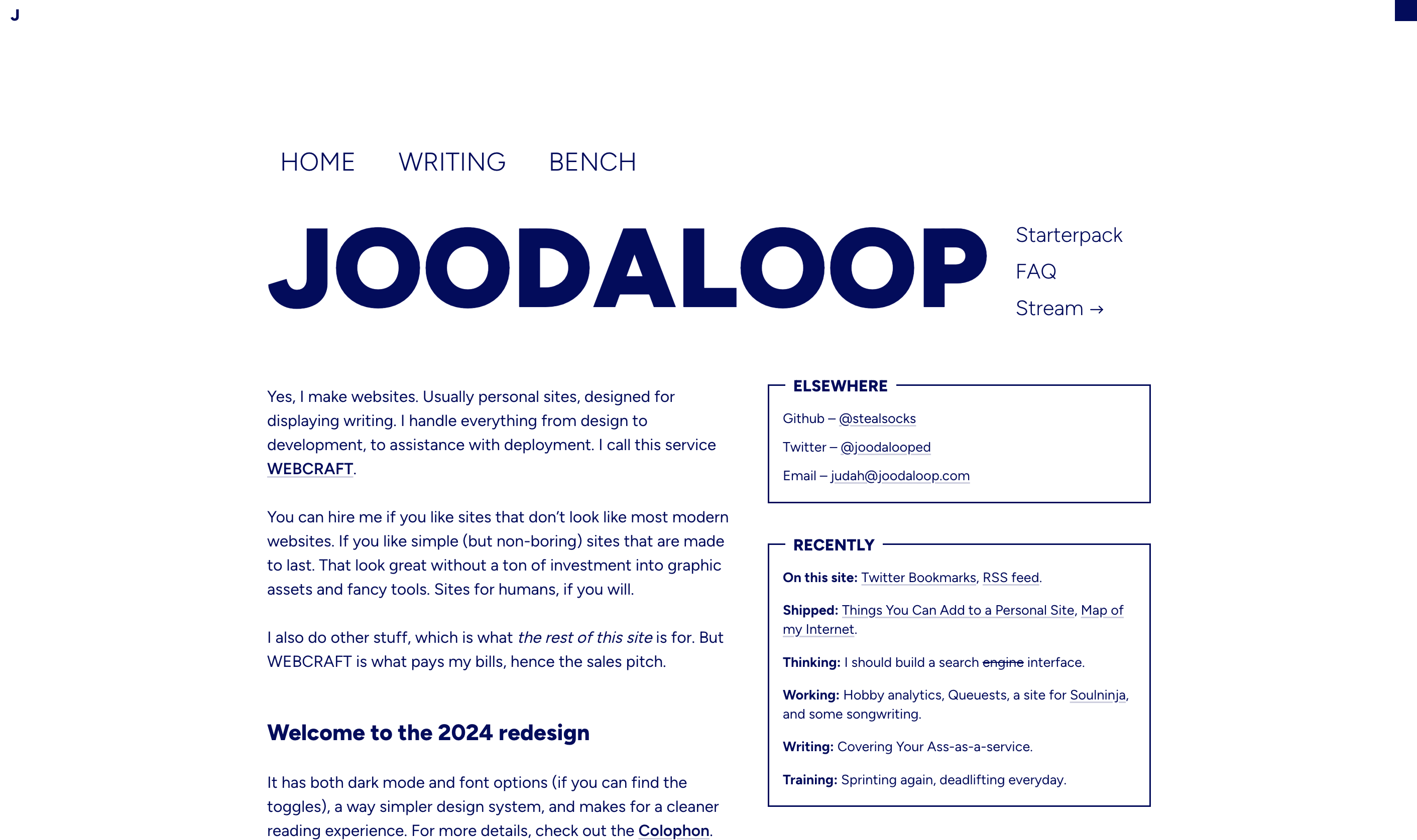
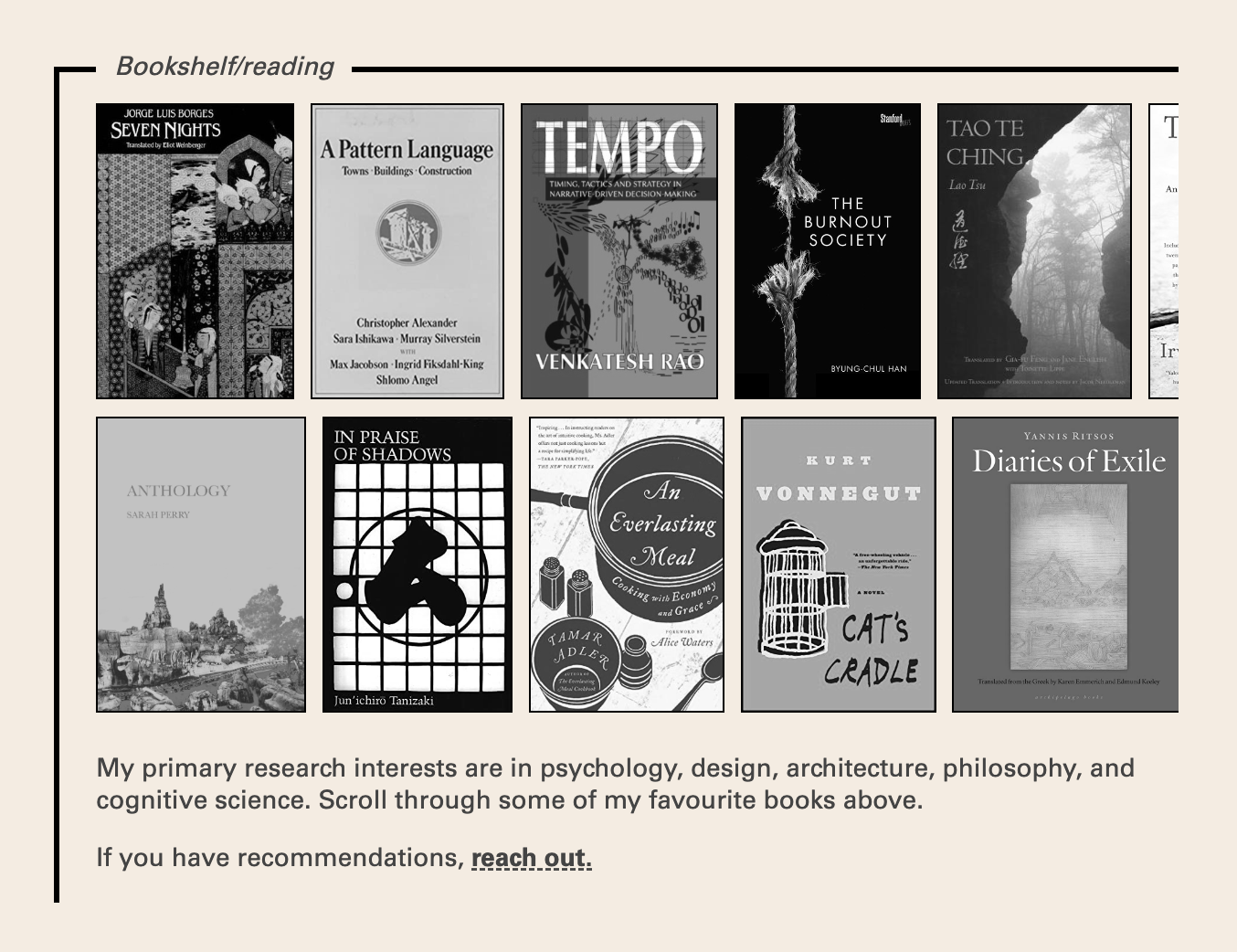
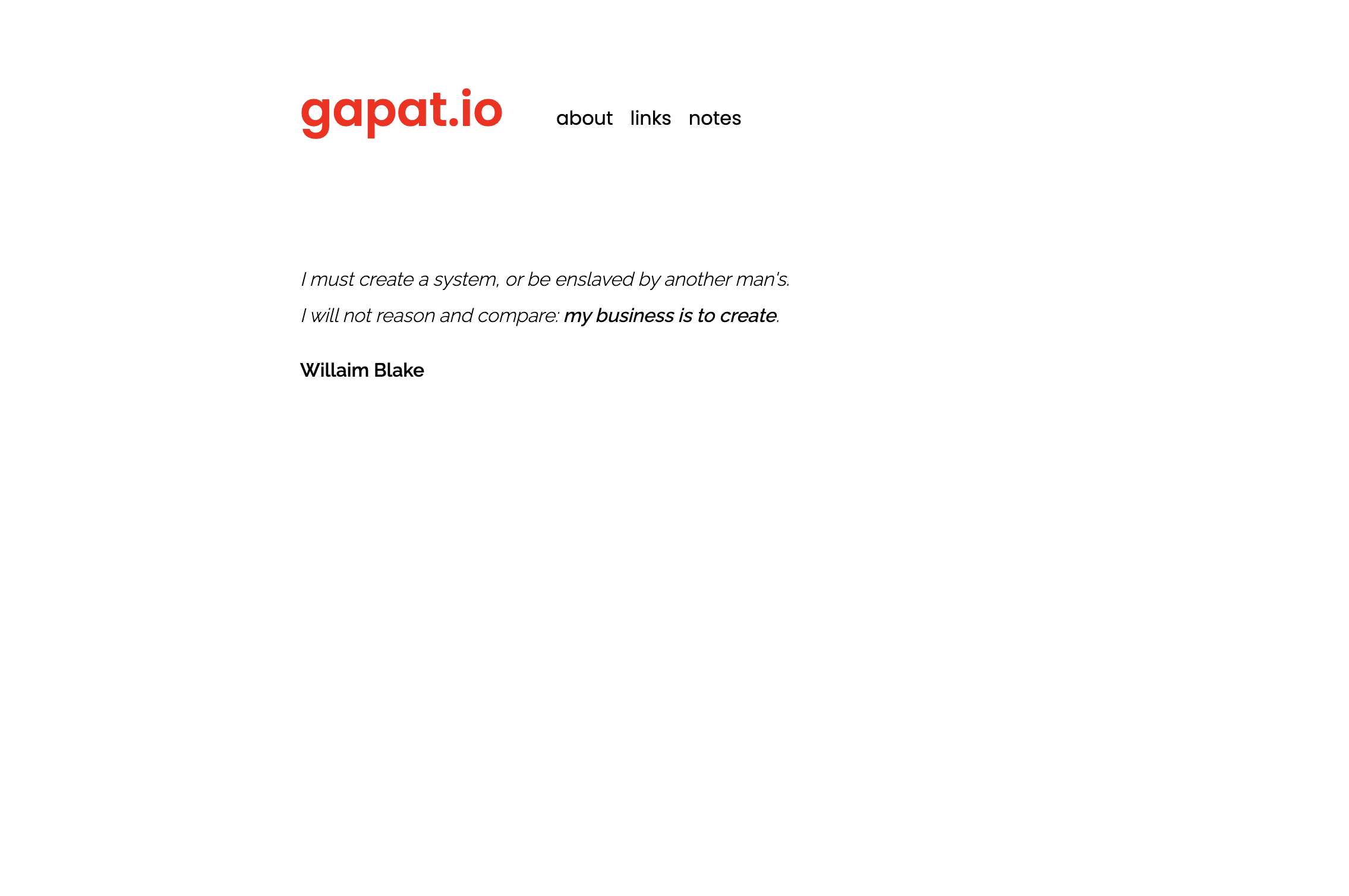
the process
Step I: You send me a list of words that describe the aesthetic you’re hoping for, the type of content you want to present, the out-there ideas and things you love. Accompany those descriptions with screenshots, moodboards, and websites you think are great examples of personal sites. Layout ideas, sketches, and assorted blueprints are more than welcome too. Dump it all into a Google Doc and send it over.
Cost: Around 2 hours of your time.
Step II: I go away for a few days to think things over, asking you a few questions while I do it. Then I come back with three (or more) rough, distinct design directions you can choose from. These will probably include layout sketches, and a list of feature ideas.
Cost: $350
Step III: If you’re sufficiently excited by the ideas I put forward, we finalise the key design choices and features and I go build the whole thing on the platform you prefer. This usually takes a week if I’m not too busy.
Cost: Custom quote
Step I is important for me to get a feel for the kind of site what you want, and how confident I am that I can, in fact, build you something nice. Step II costs a flat fee ($350) and, in the worst case, leaves you with the best 3 high-level ideas I could think of.
Once you pick a direction, decide on what features to include, and what platform you want the site to be hosted on, I can start with Step III. Pricing for this step is determind by…
a) The level of complexity. If you want a polished-but-minimal theme, you pay less than what you would for a really detailed site involving careful layouts and intricate details.
b) Urgency. If you have a tight deadline, I’m willing to prioritise your project over any ones that are in progress, but it will cost you 10-20% more to skip the line.
When the development of the site/theme is complete, I will help you set it up. If you need further modifications, or in-depth assistance, those services will be billed at $50/hour. Legitimate bug fixes, however, are completely free. I care about fixing mistakes and inconsistencies as much as you do.
Upon payment, you recieve the ownership rights for the site and are free to modify, transfer, or convert the design into whatever form you like. You could even put your theme up for sale if you really wanted to, although that kinda defeats the purpose of having a personalised design.
postscript
I want to make beautiful websites. I want to make messy websites. I want to make websites that feel like a cozy attic. I want to make elegant websites. I want to make painstakingly hand-crafted websites. I want to make unreasonably intricate websites.
There's been a 200-year long design trend towards "clean" and extreme legibility, which should be questioned.
What kind of website would Chaucer make? What about a Pharaoh? What would a 1600s colonial town hall want to make? A Vienna coffeehouse from the same time period?
Where is the Pyramids of Giza of websites? What is the Cathedral of Notre Dame or Temple of Artemis of websites?
Where is the web Acropolis!
We must build it! We must put forth this wonder into the world. I have convinced myself. Though I still don't yet know where to begin.
Things I care about: Typography, delightful minimalism, semantic HTML, information architecture, performance, progressive enhancement, silly details.
There are these sites which look like absolute works of art on a first glance, but they tire your senses and overwhelm your brain with too many animations. These sites are unusable on a day to day basis.
Then there are sites which look delightful but also make you want to revisit them again and again. Most (probably all?) of the time they are delightfully minimalistic.